Adaptive Compose
Reimagining how 300M+ users compose messages on mobile, making communication faster, smarter, and more contextual.
Reimagining how 300M+ users compose messages on mobile, making communication faster, smarter, and more contextual.
Adaptive Compose kicked off a new chapter in how people connect and collaborate in Microsoft Teams. Since Compose sits at the center of communication, it plays a major role in shaping the experience. With user insights, feedback, and product goals in hand, I set out to rebuild it into something smarter, more intuitive, and seamless to use.
Case studies can be pretty long, so I challenged myself to summarize the entire project in 5 minutes or less. If you want to dive into the process, keep on scrolling. Otherwise, sit back, dial in, and watch my case study on Adaptive Compose (you'll wonder why I'm not a YouTuber).
A collaboration hub is only as strong as its foundation, and Compose had started to show cracks. Features kept stacking up without a clear structure, creating a cluttered experience that no longer aligned with real user needs. If we expect people to collaborate with ease, the design has to support that from the ground up.
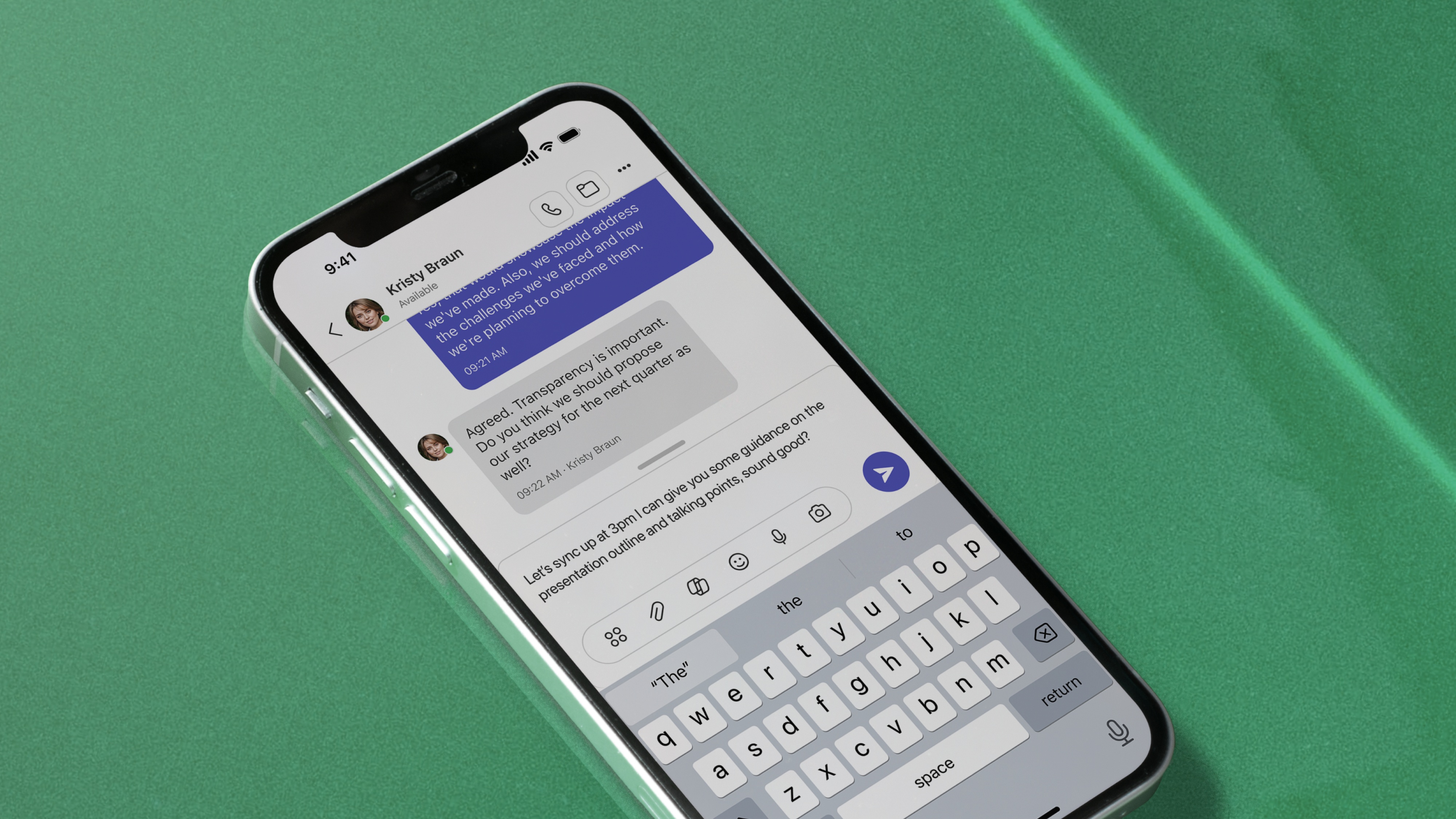
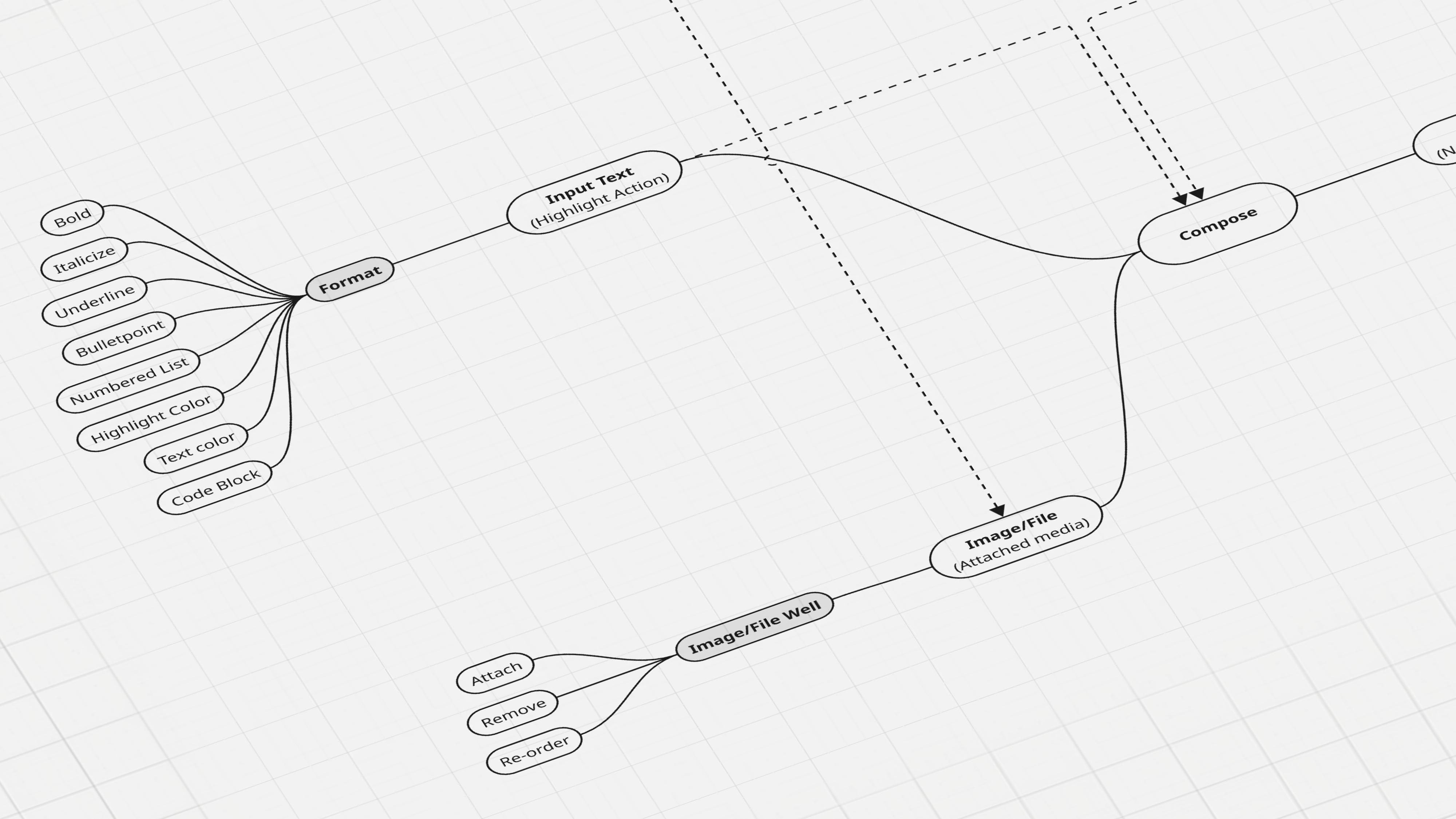
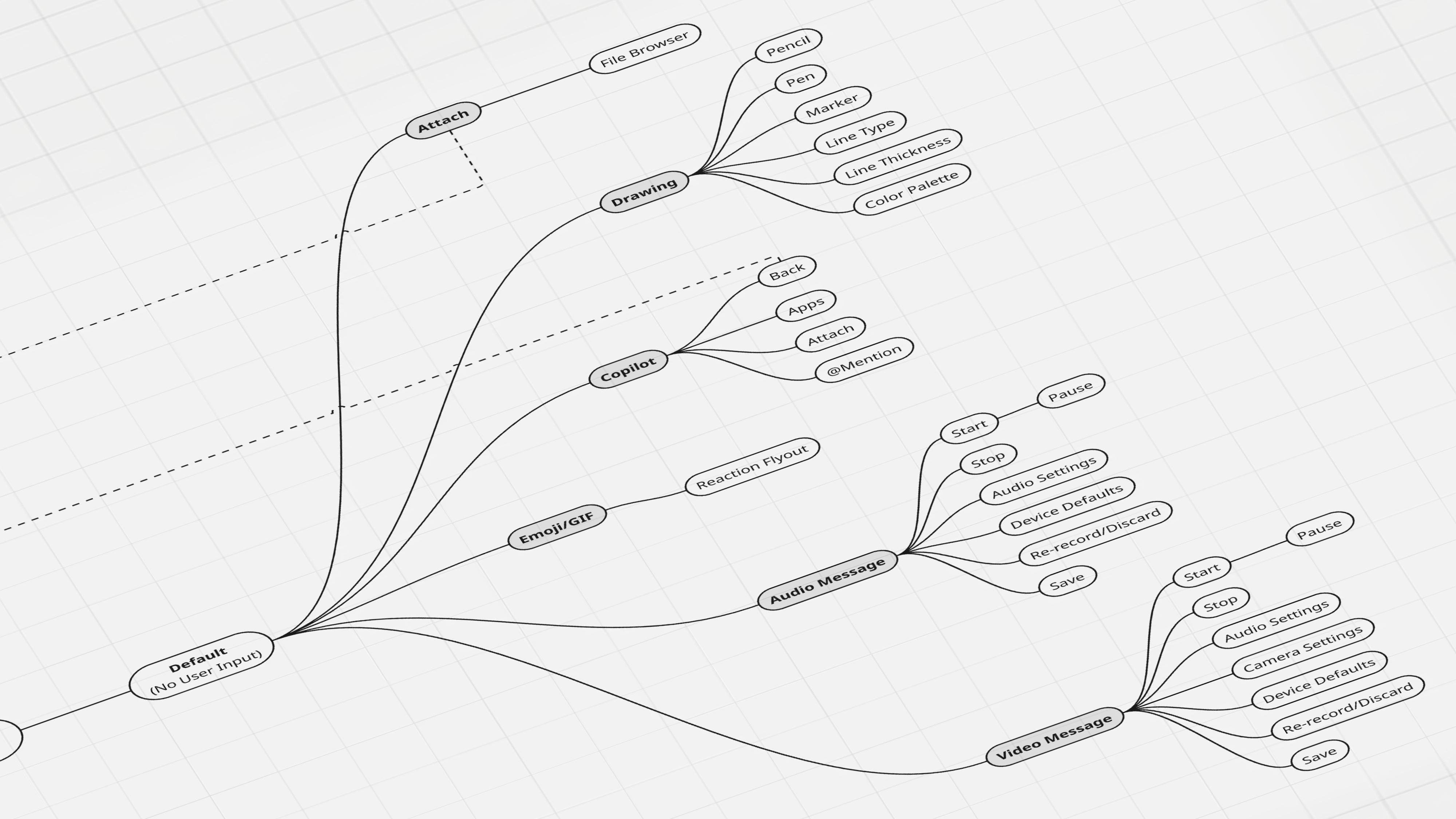
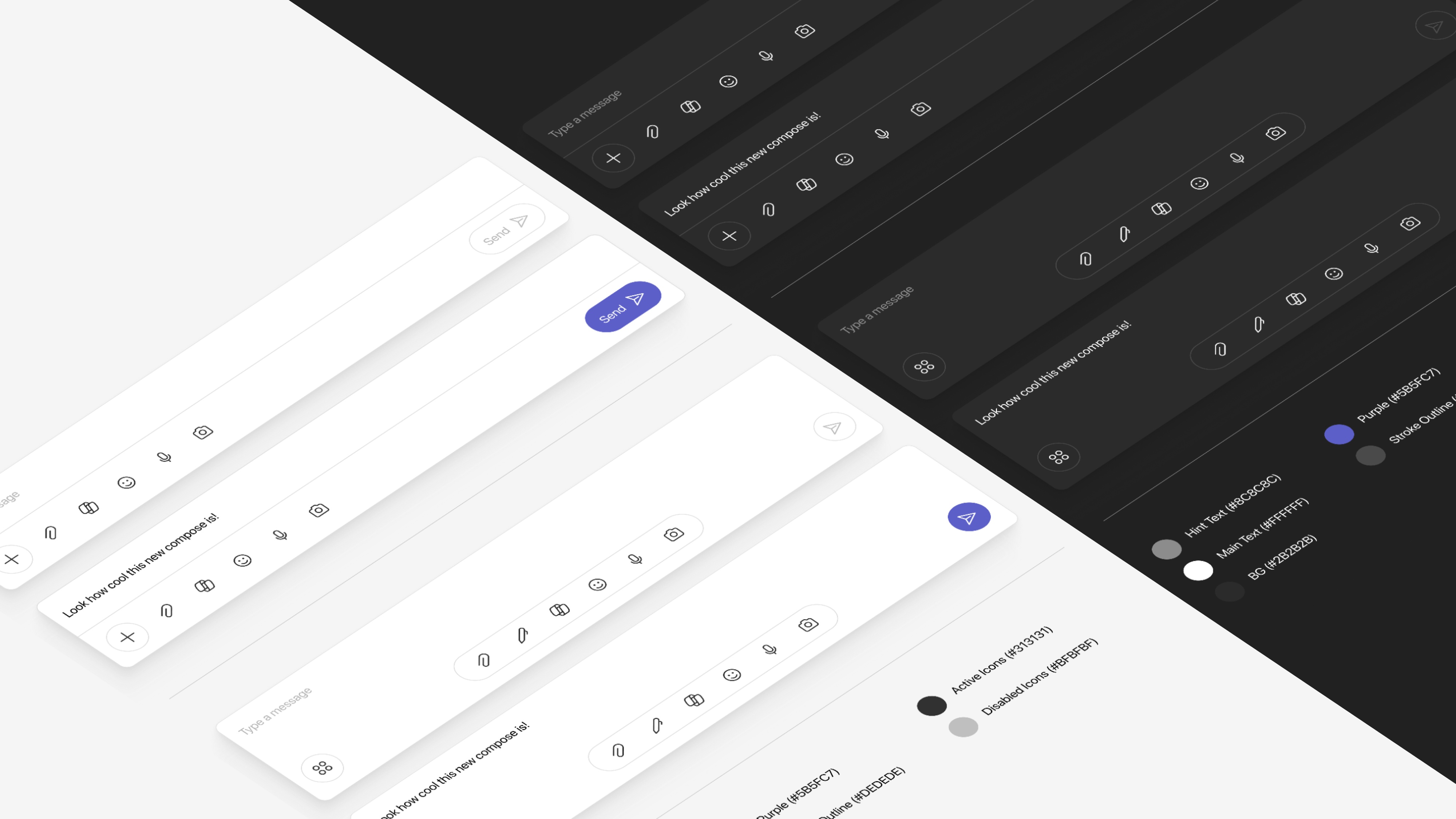
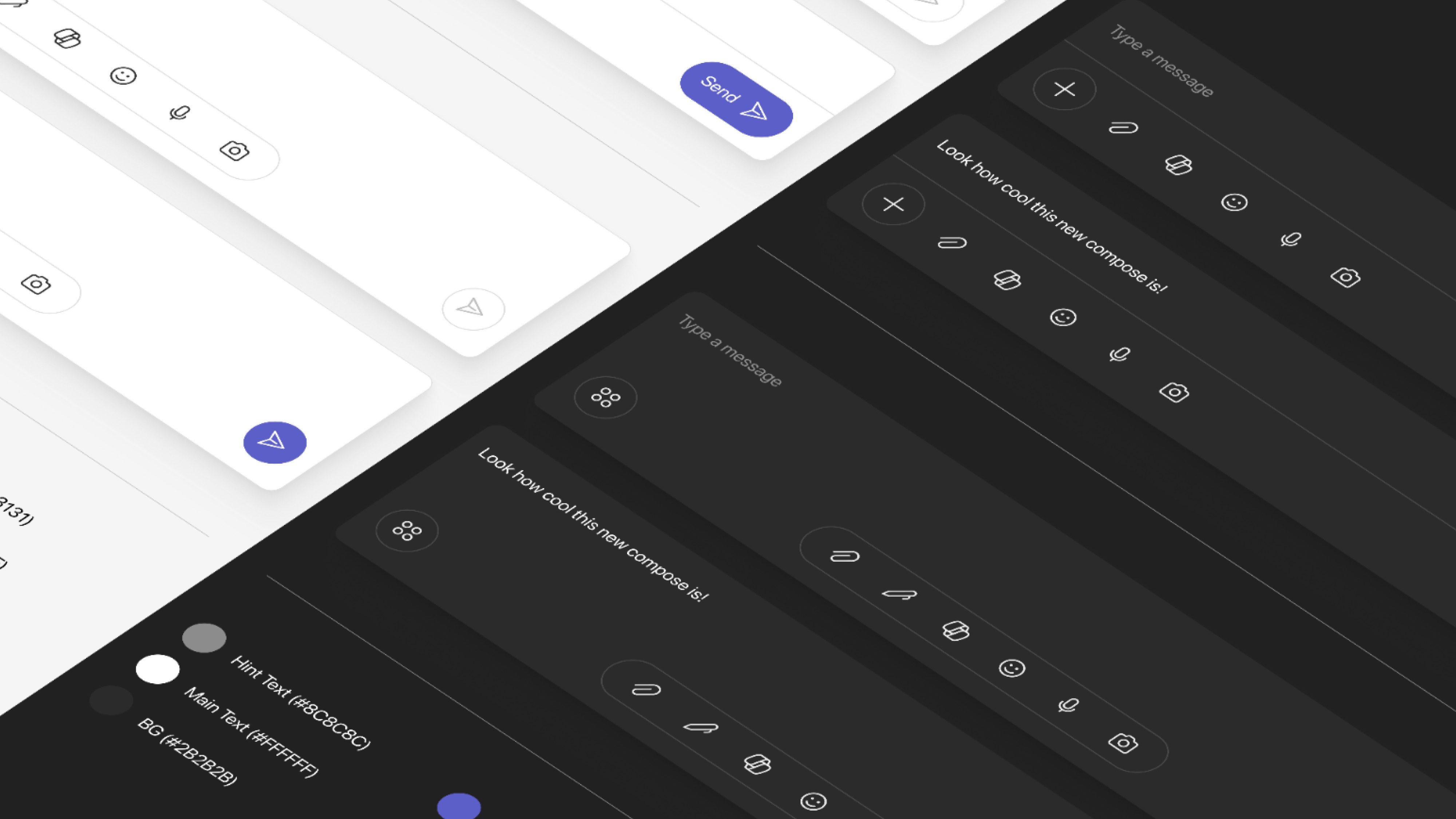
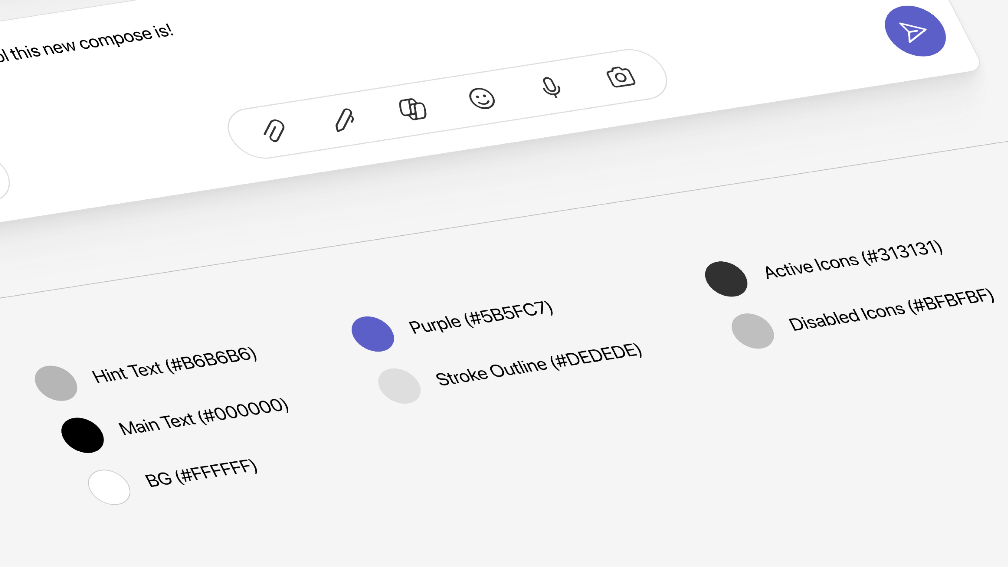
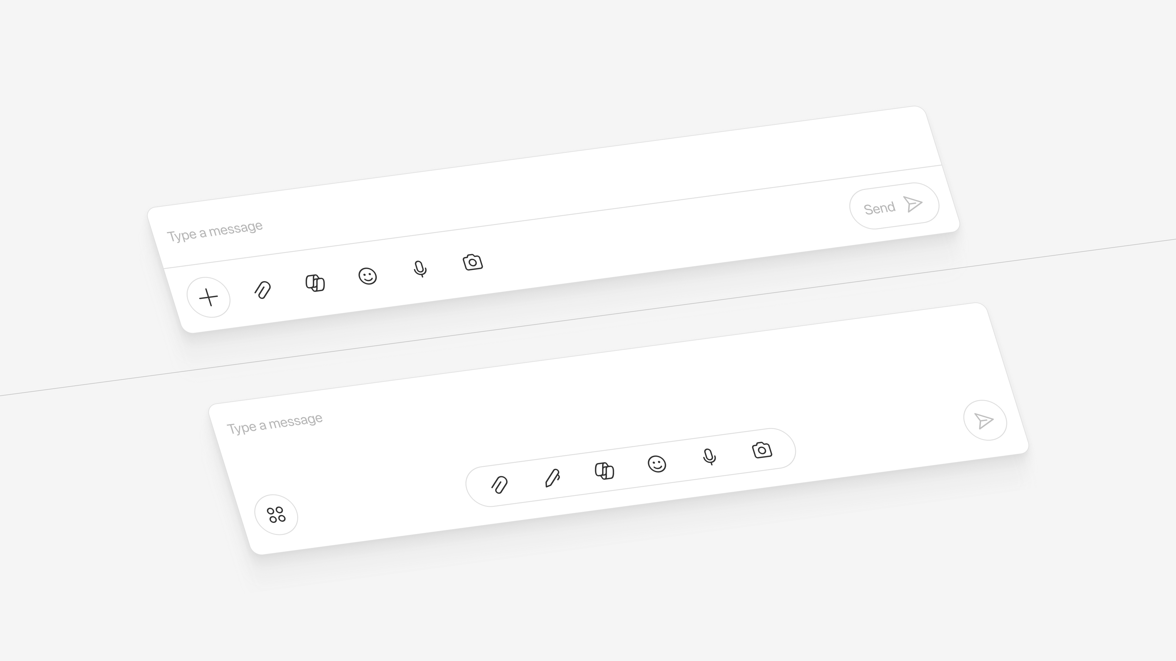
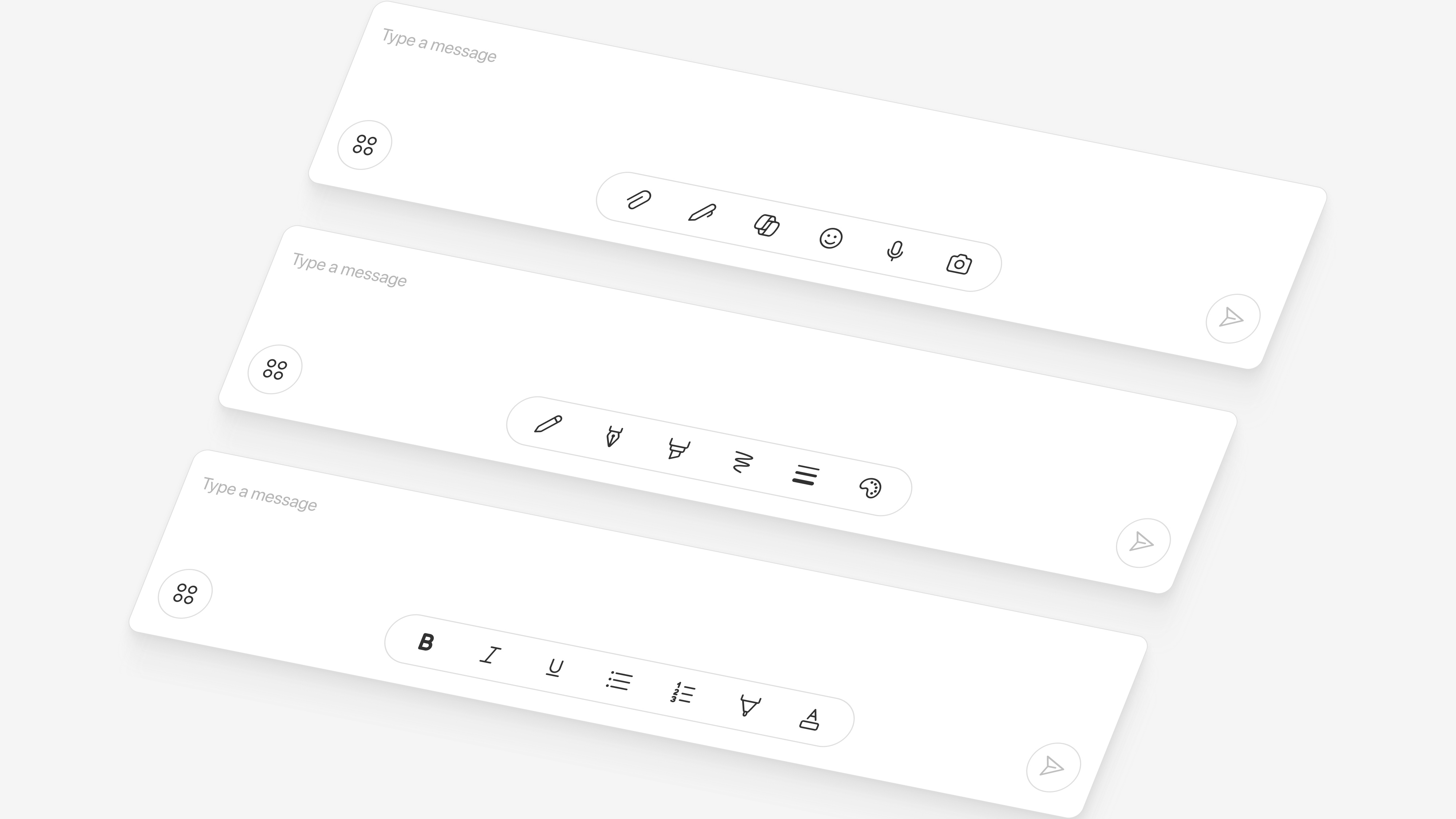
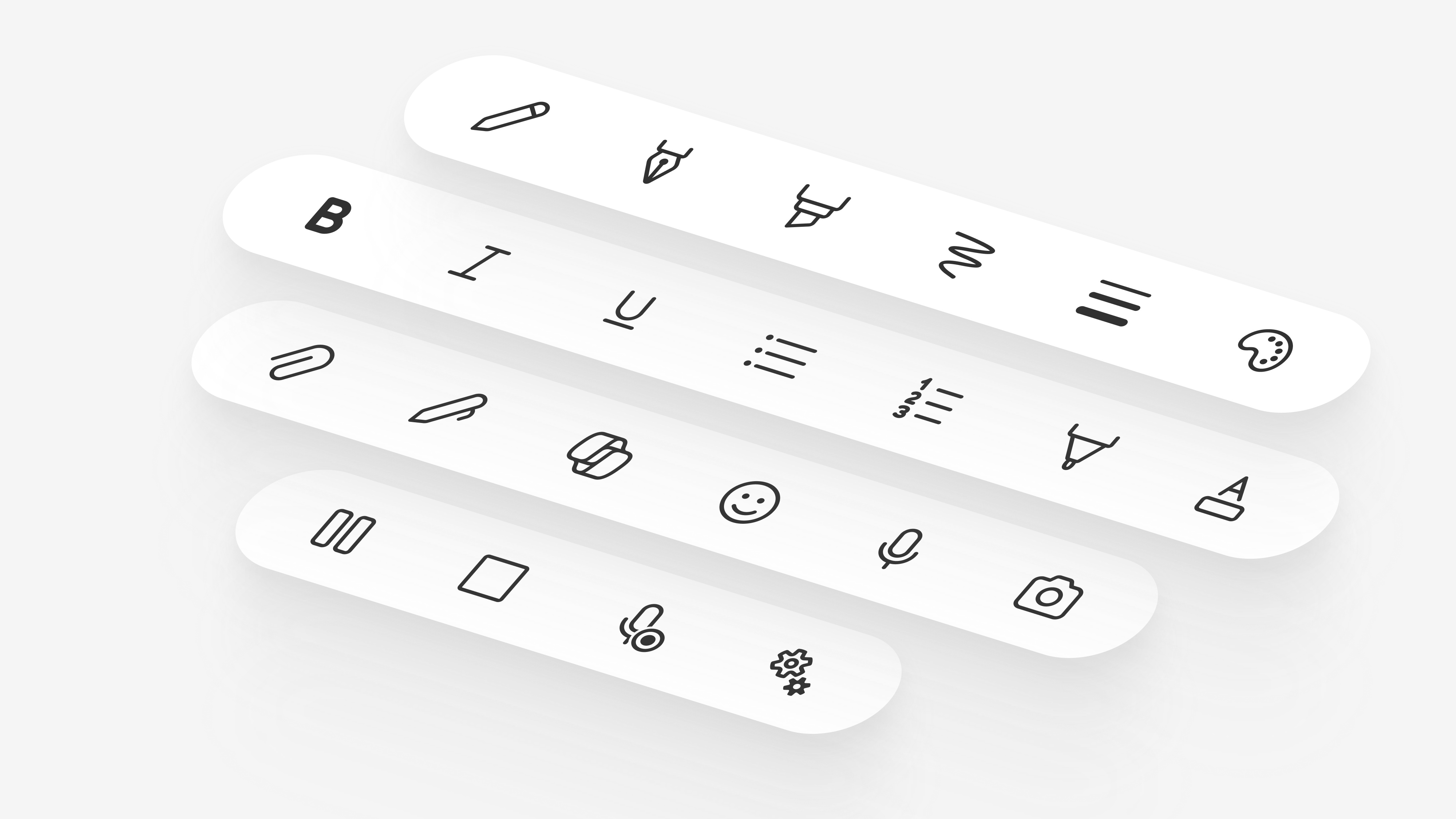
Key actions like formatting or attaching stay hidden from sight, leaving people hunting for tools.
Compose changed behavior across screens which pushed users to adapt to several patterns for one simple action.
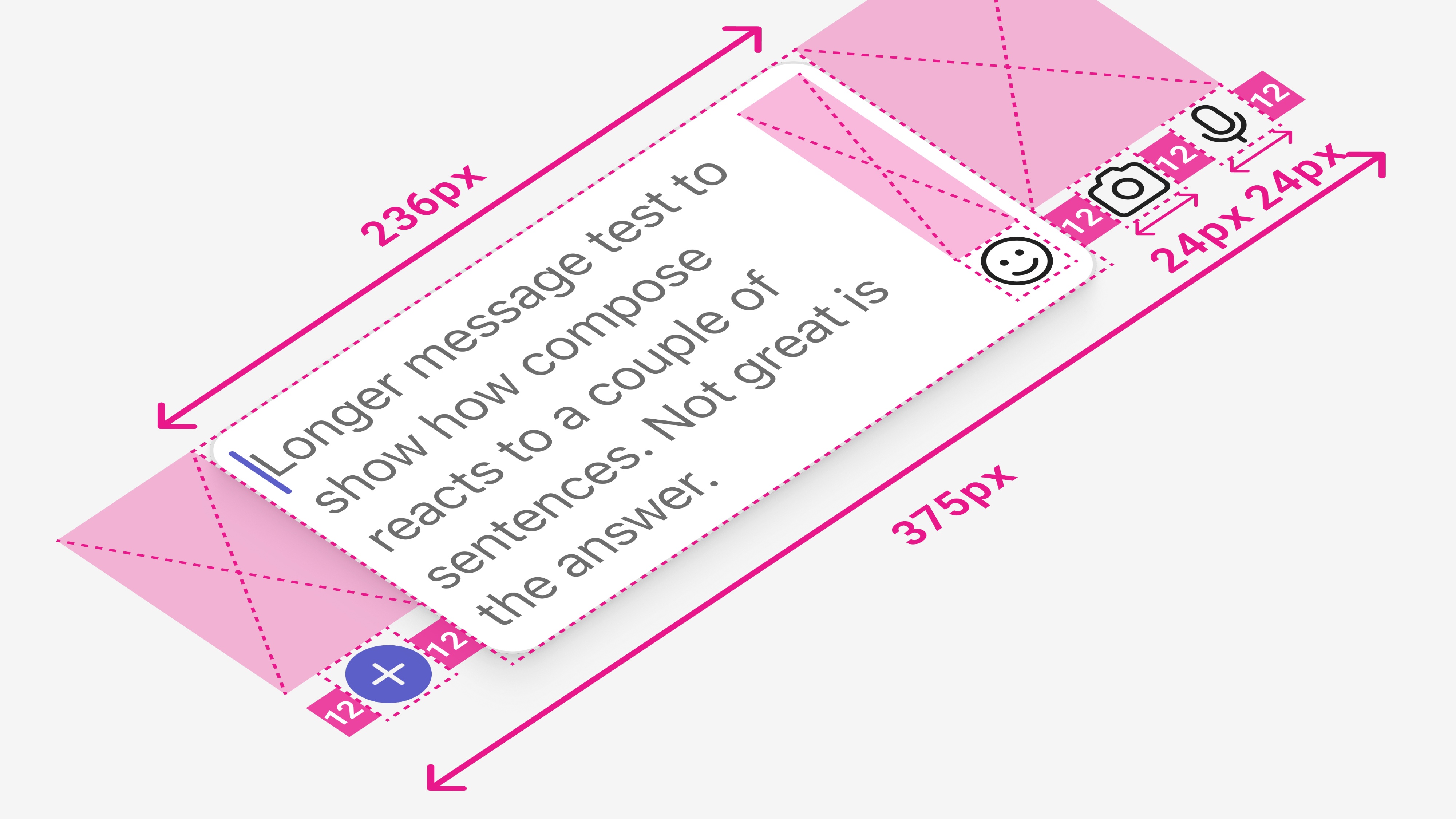
Across devices Compose feels short on room and a crowded writing space makes it harder to focus or feel inspired fully.
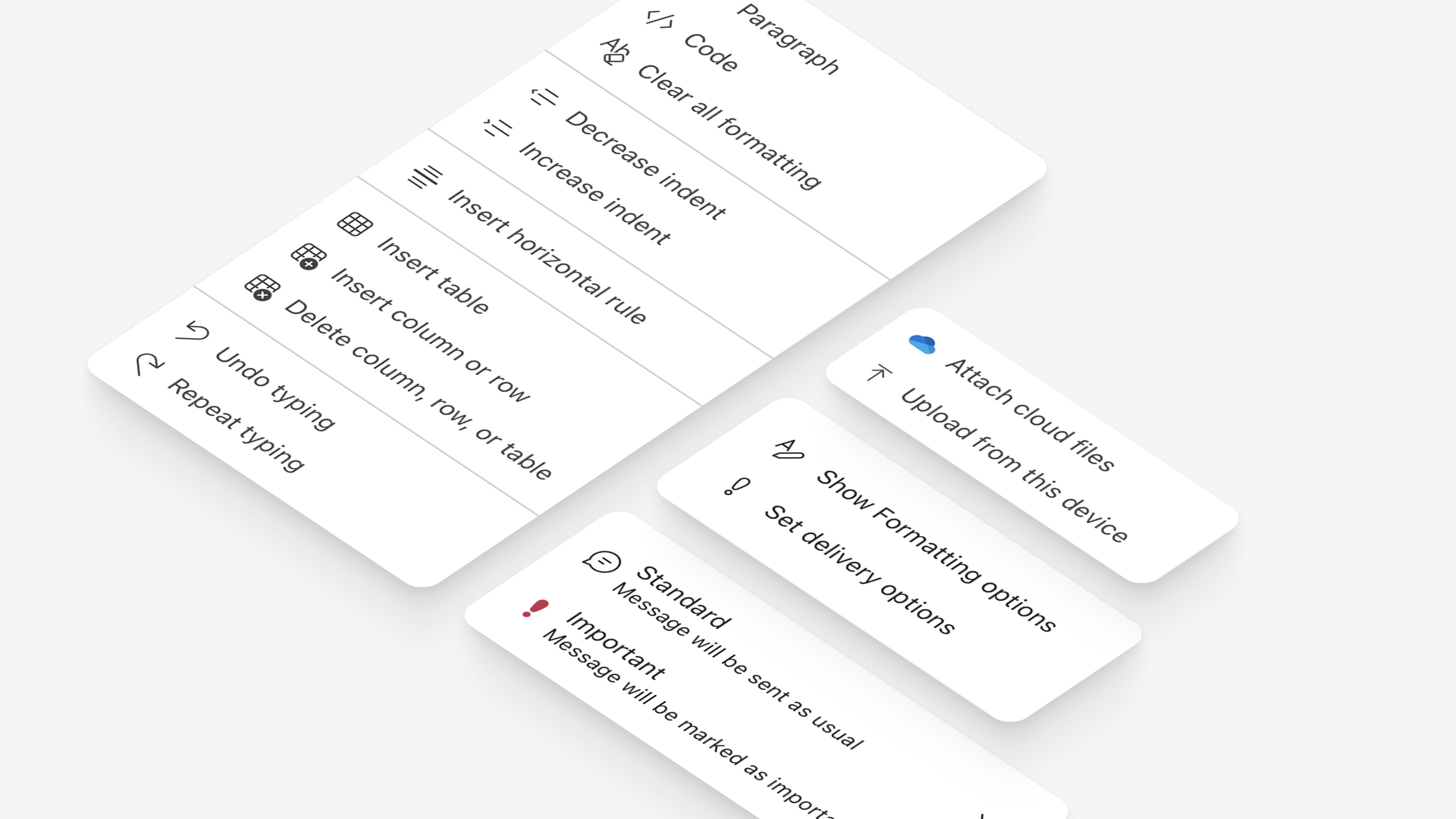
Vital tasks like formatting stay out of sight, tucked into menus that slow people down when they need fast access most.
Teams is a massive product with a complex organizational structure. Compose sits at the intersection of multiple feature teams, platforms, and disciplines. I took the lead in bringing these groups together, aligning on a shared vision, and ensuring design cohesion across Mobile and Desktop, Chat and Channels, and the supporting teams that touch every part of the experience. It meant building relationships, facilitating tough conversations, and keeping everyone moving toward the same goal.
To truly understand our users' needs and challenges, I used a mix of qualitative and quantitative research methods. This combination gave me rich insights into real-world scenarios and use cases, helping me zero in on the many ways people collaborate across industries, roles, and workflows.
"I just want to attach a file. Why is it buried three menus deep?"
Users were frustrated that basic actions like formatting or attaching files were hidden and hard to access.
"It's like something from five years ago, Slack feels modern"
Users felt that Compose, along with other components, looked outdated compared to competitors.
"So much stuff on screen, I can't focus on what I'm trying to do."
Users felt that Compose lacked the space and flexibility needed to craft their messages effectively.
"I give up on my phone, It's easier to just wait till I'm at my desk."
Users avoided working on devices other than desktop due to a cumbersome and inefficient experience.
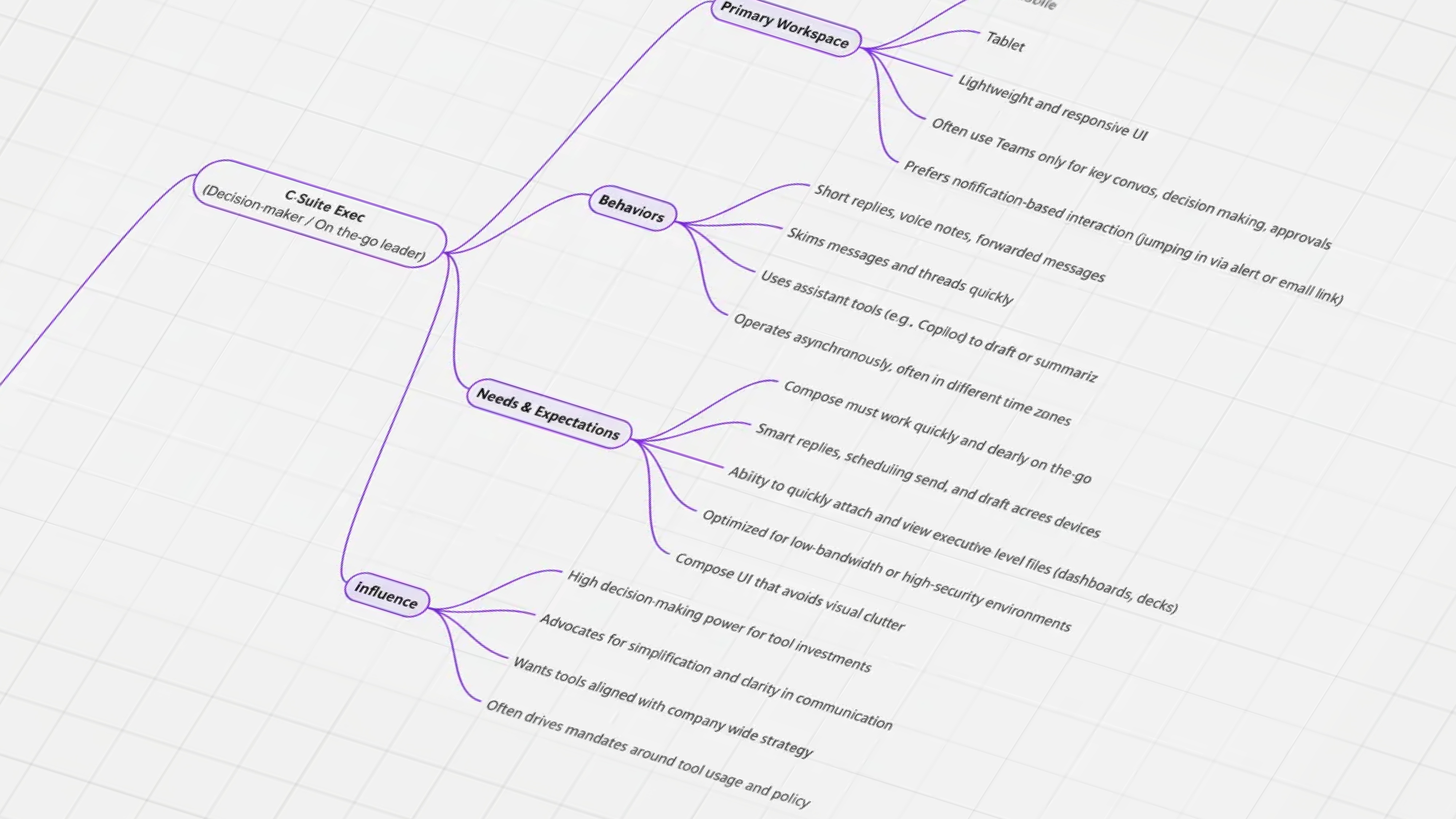
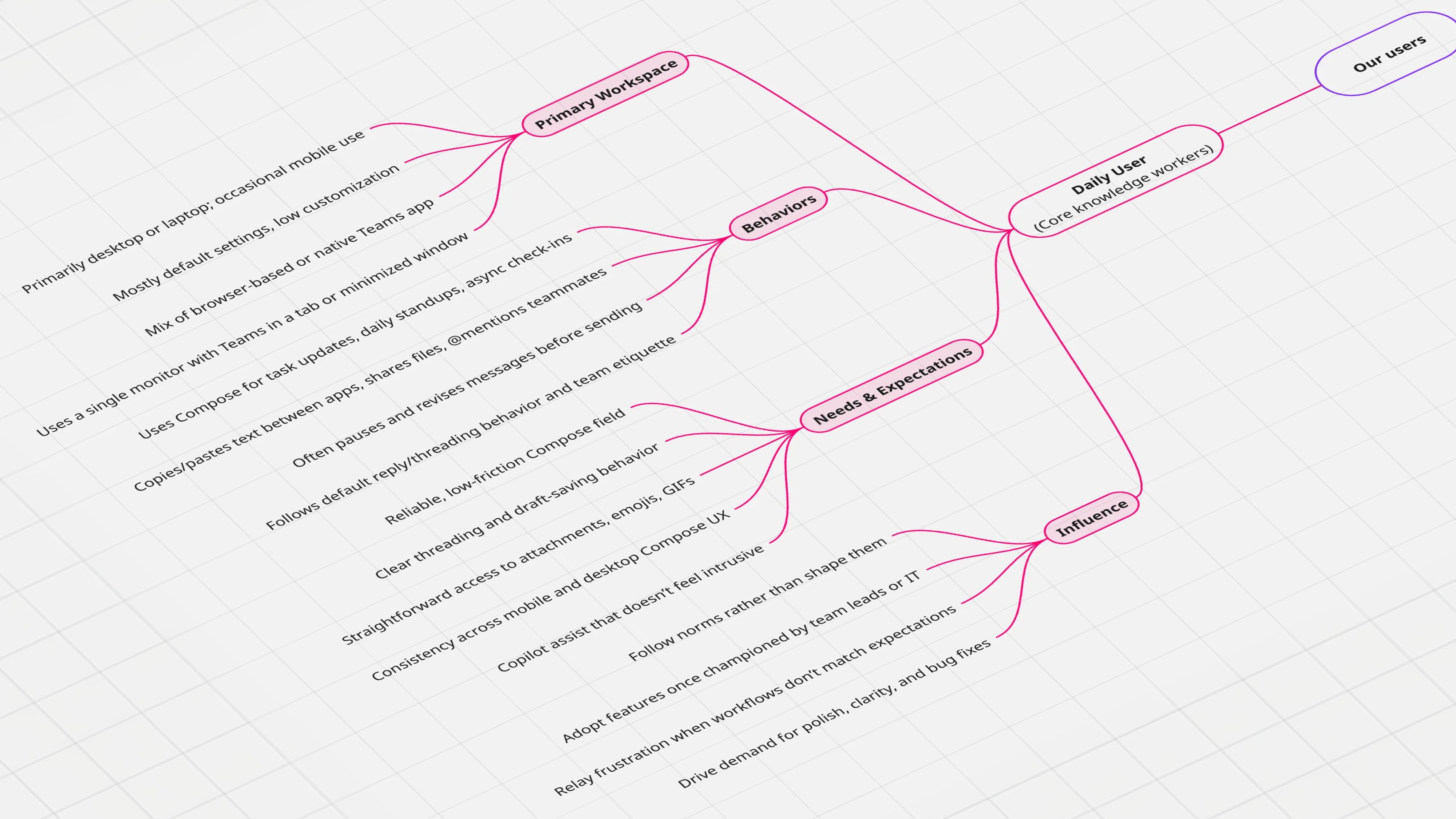
I organized the research into a clear view of our users by mapping the situations, needs, and behaviors that shape their work. This led to three core user segments and four pillars that define their experience. As I explored concepts, I built step by step journeys to spot friction early and shape smoother transitions. This was also the time to push for simplicity, refining or removing anything that did not support an effortless flow.
Lead with simplicity, but design for growth, building an experience that expands naturally with the user over time.
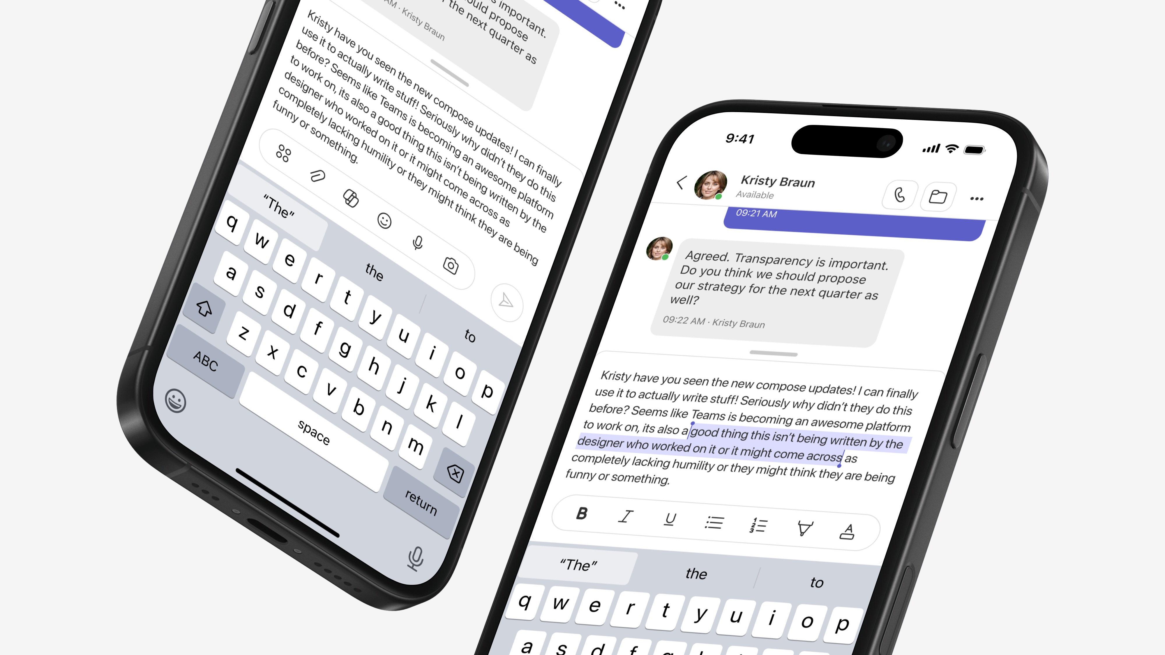
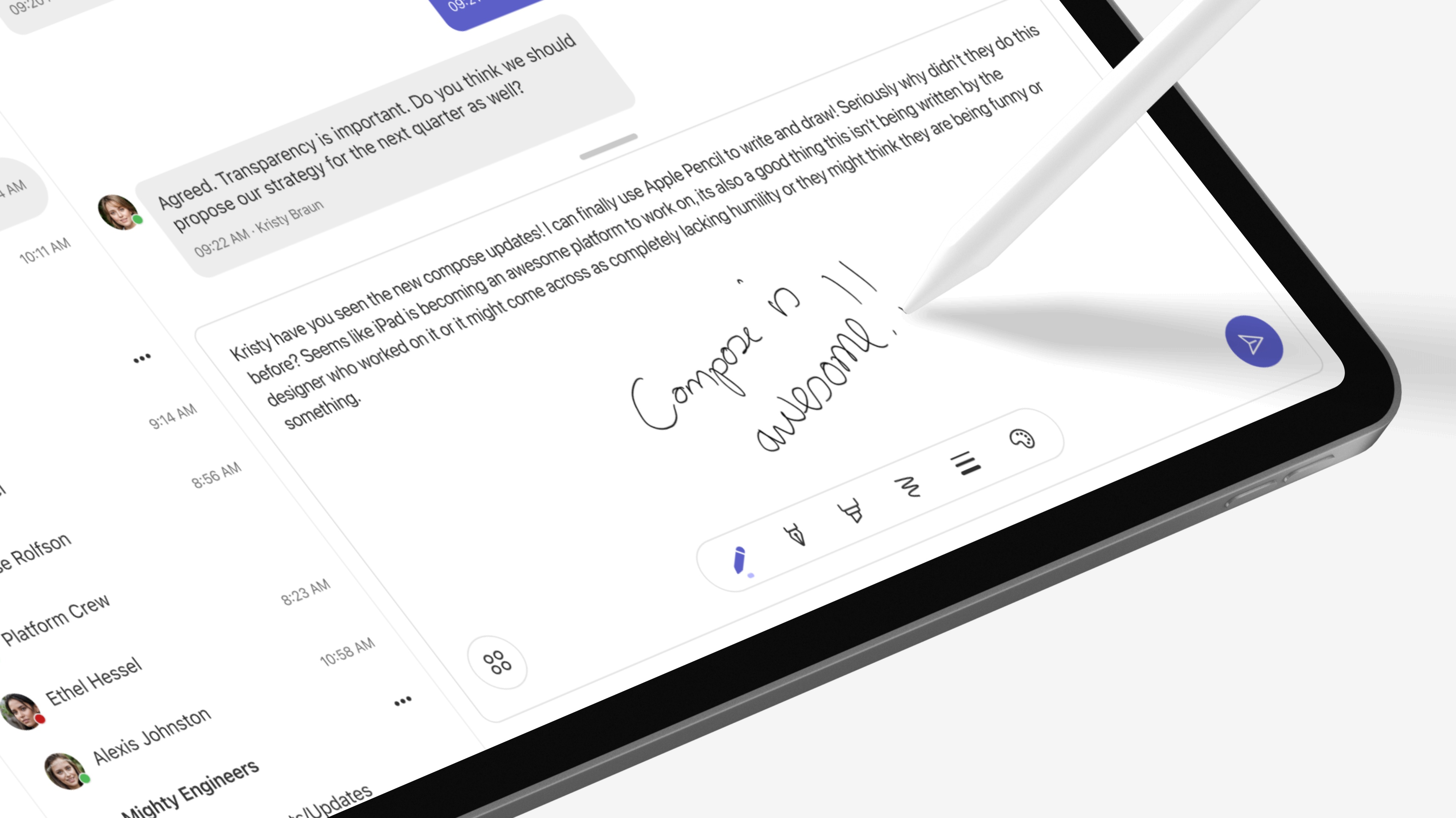
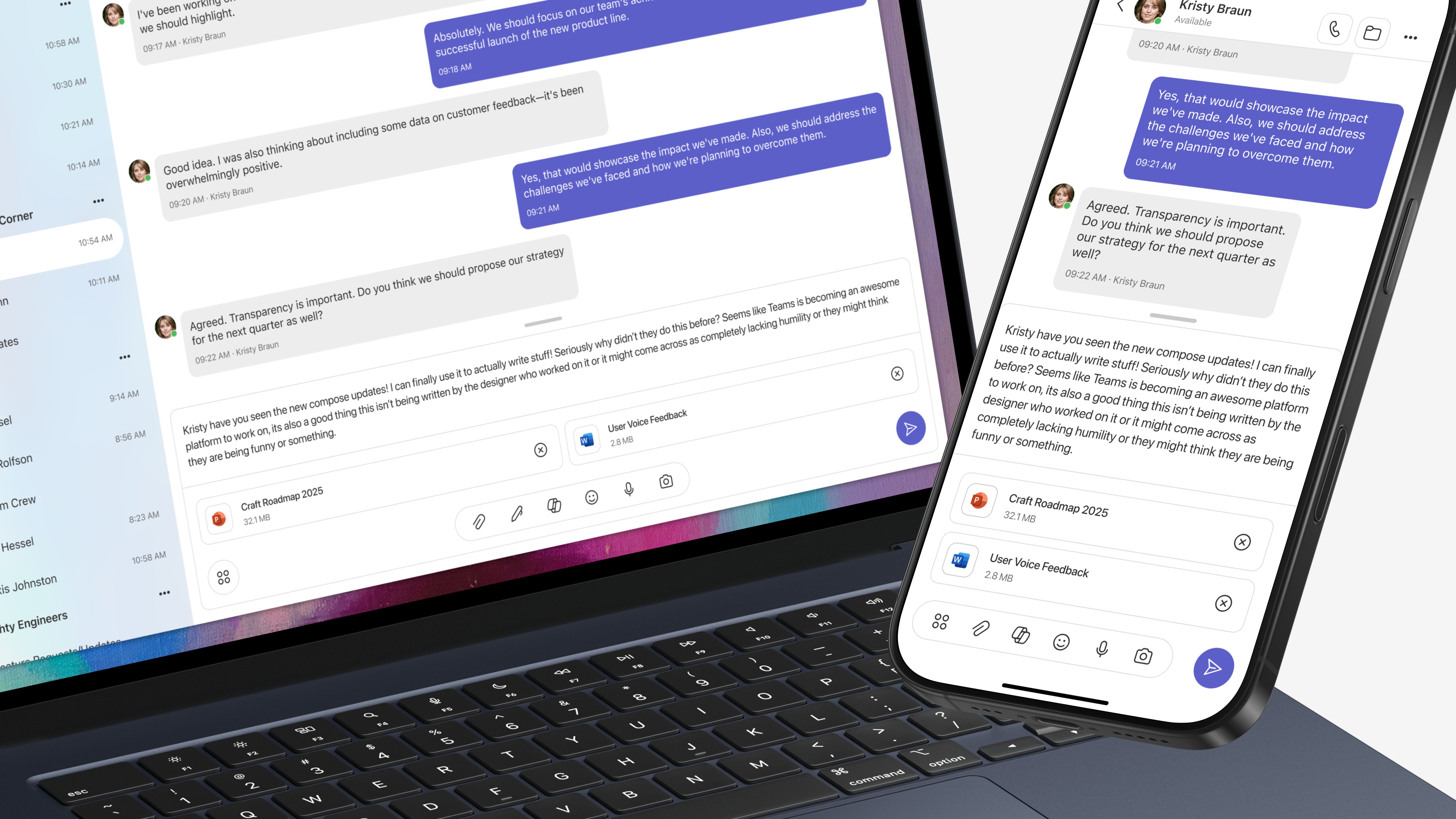
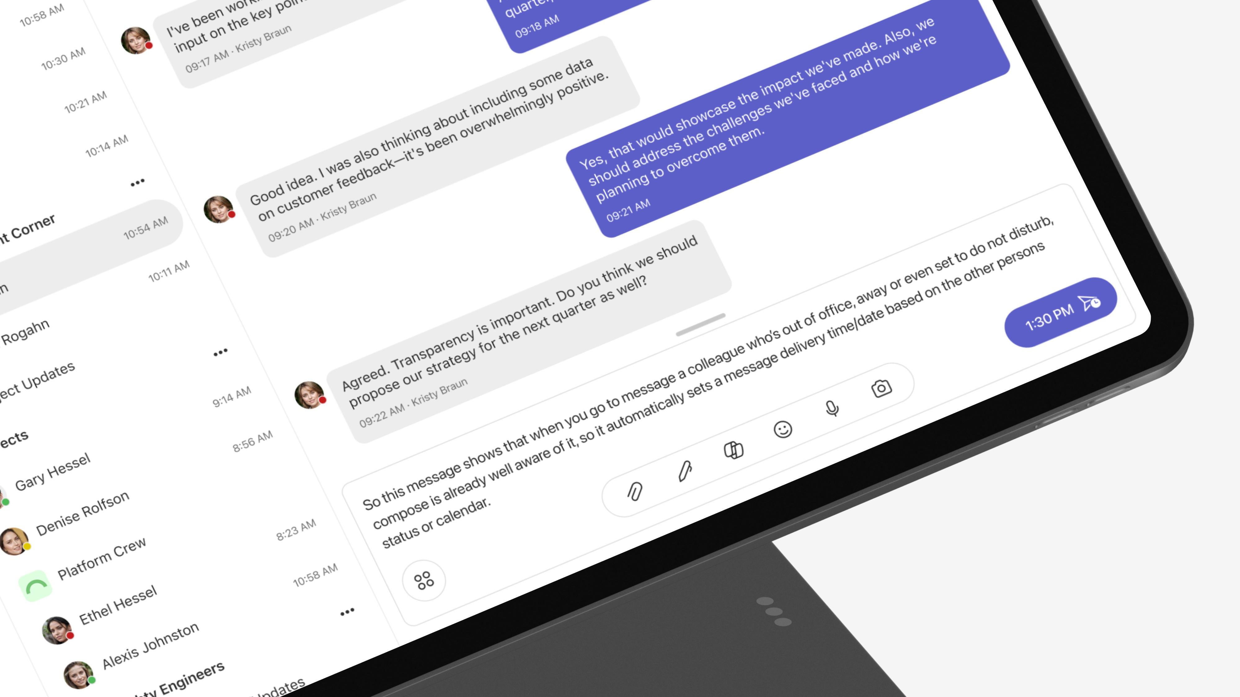
A responsive Compose experience should be device-aware, tailored to the context without limiting functionality.
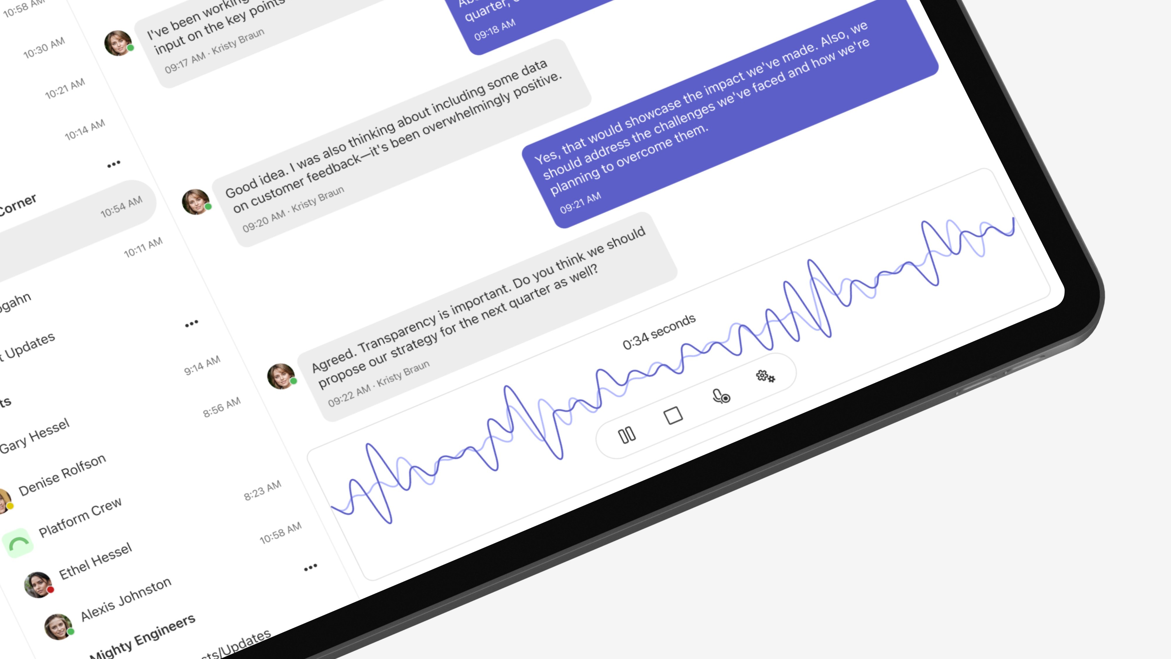
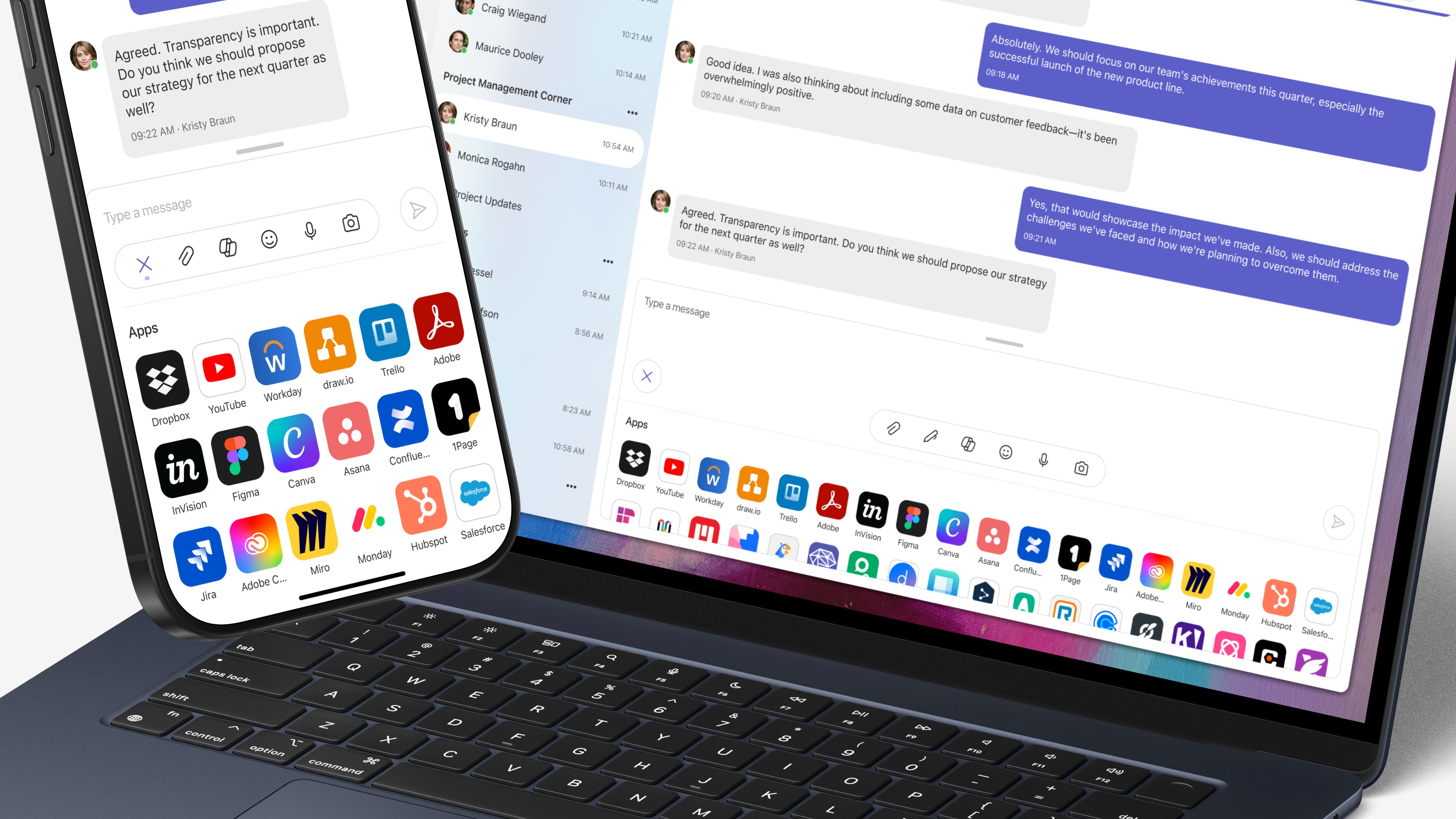
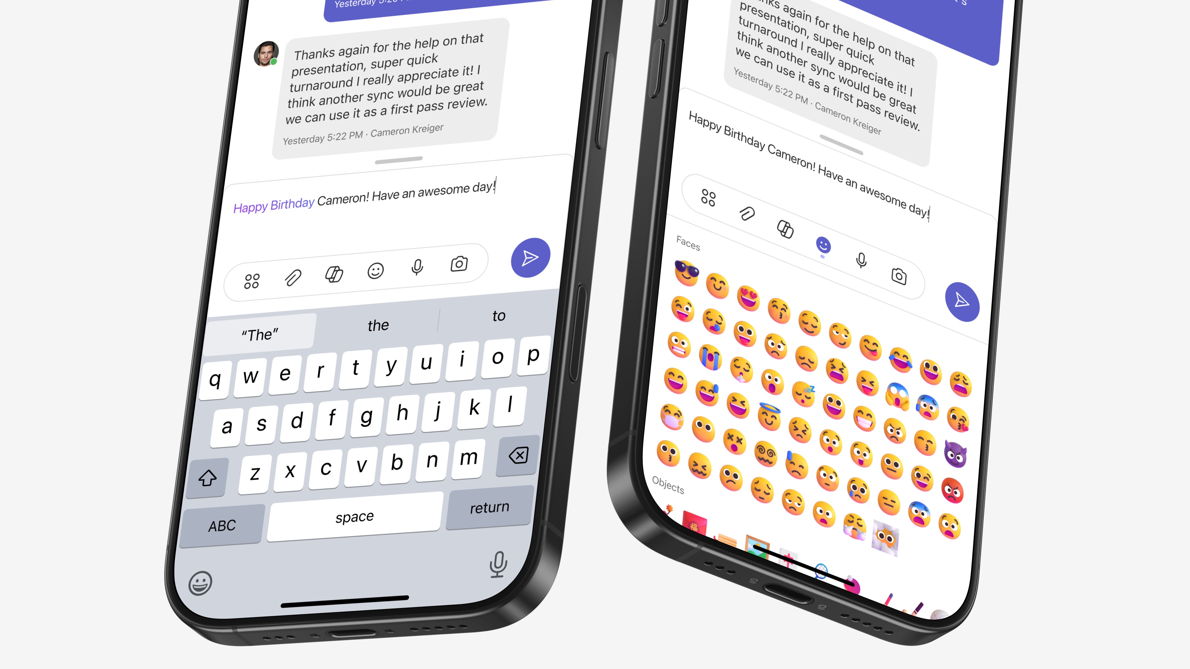
Compose should be dynamic, responding to each user's unique context by surfacing the tools they need, exactly when they need them.
This is where I slowed down to redefine what success should look like for the experience. It was not only about whether a message was sent, but about the quality of the path that led there.
The old view treated success as a simple binary: sent was good, abandoned was bad. That framing ignored the nuance in how people actually work. I teamed up with research and data to rethink our metrics and build a framework that reflects real behavior and real needs.
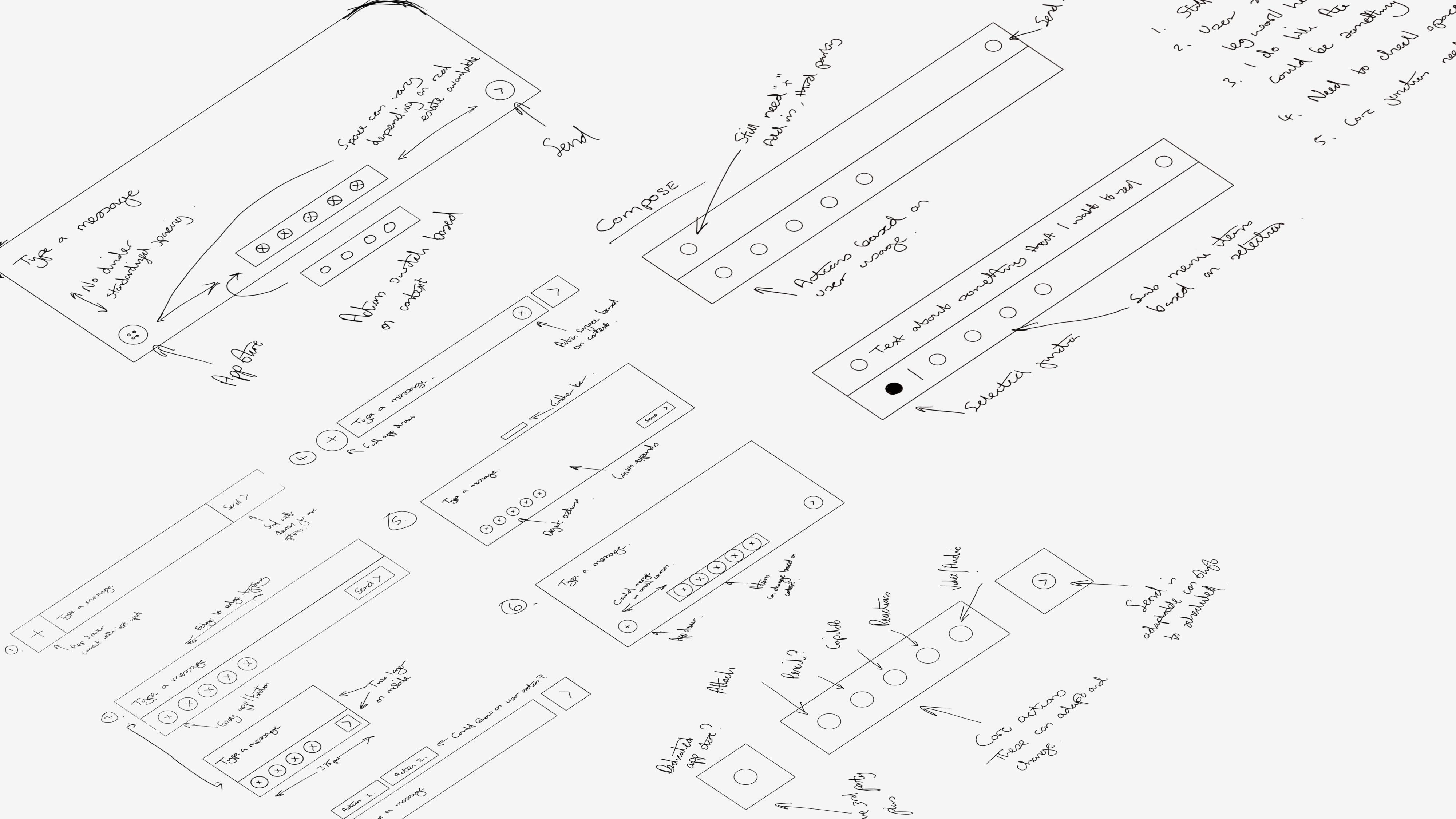
I start on the iPad with quick, loose sketches to explore ideas and spot the ones with real potential. Once something shows promise, I turn it into low fidelity visuals or simple prototypes. This phase moves fast. Concepts shift, I share updates with the team, and early feedback helps shape what comes next.
I gathered the team around the strongest sketches and, with quick critique, we narrowed everything to two testable directions. Version 1 stayed close to the current Compose for an easier shift. Version 2 pushed into a focused, canvas driven flow that reimagined how people work in Compose.
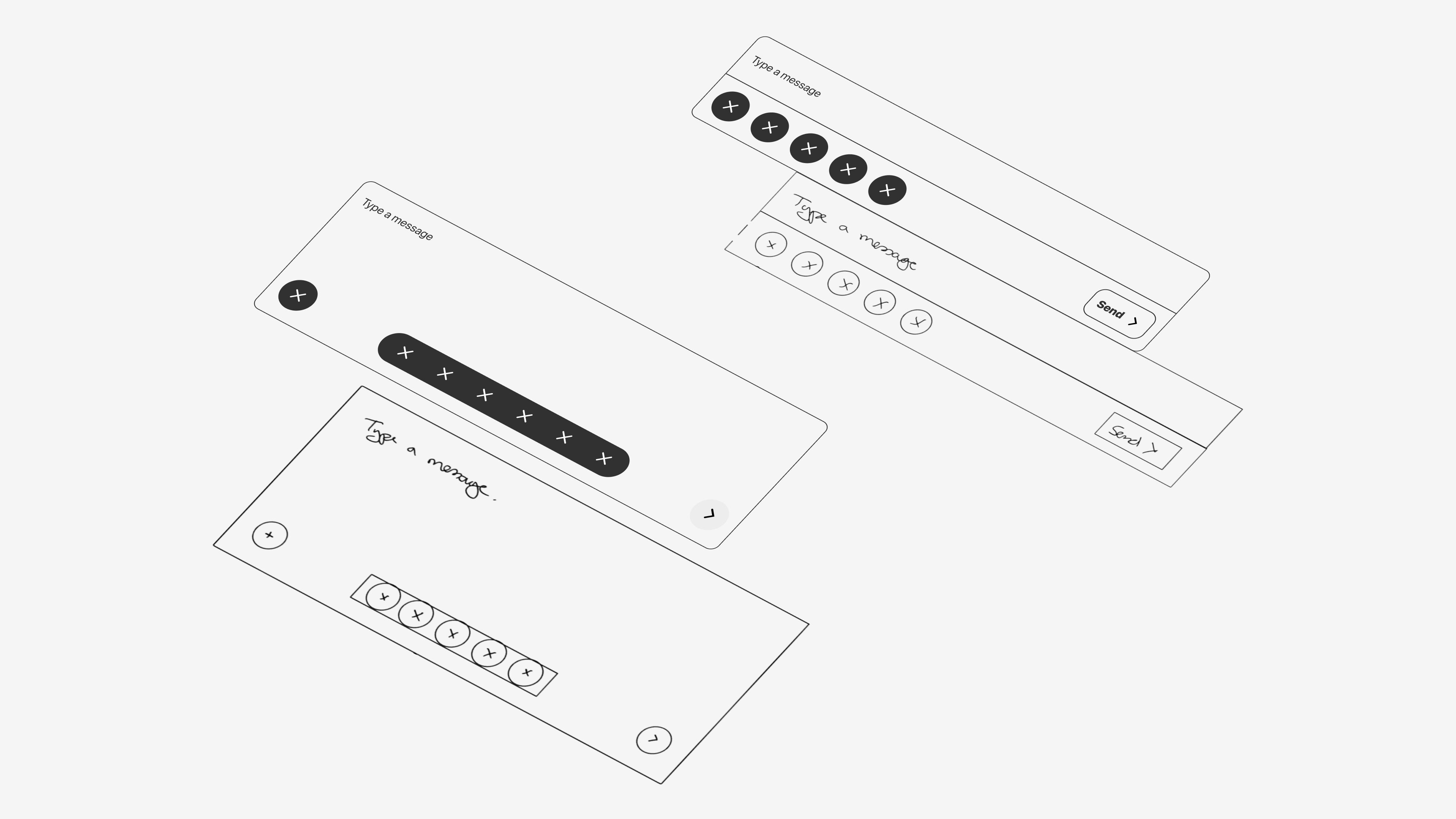
With two strong directions on the table, I moved into wireframes to pressure-test each concept. Option 1 kept the familiar Compose structure while surfacing actions more clearly. Option 2 took a bolder leap, reimagining the entire flow around a focused, adaptive canvas. Building out both in parallel helped us see the trade-offs and gave stakeholders something concrete to react to.
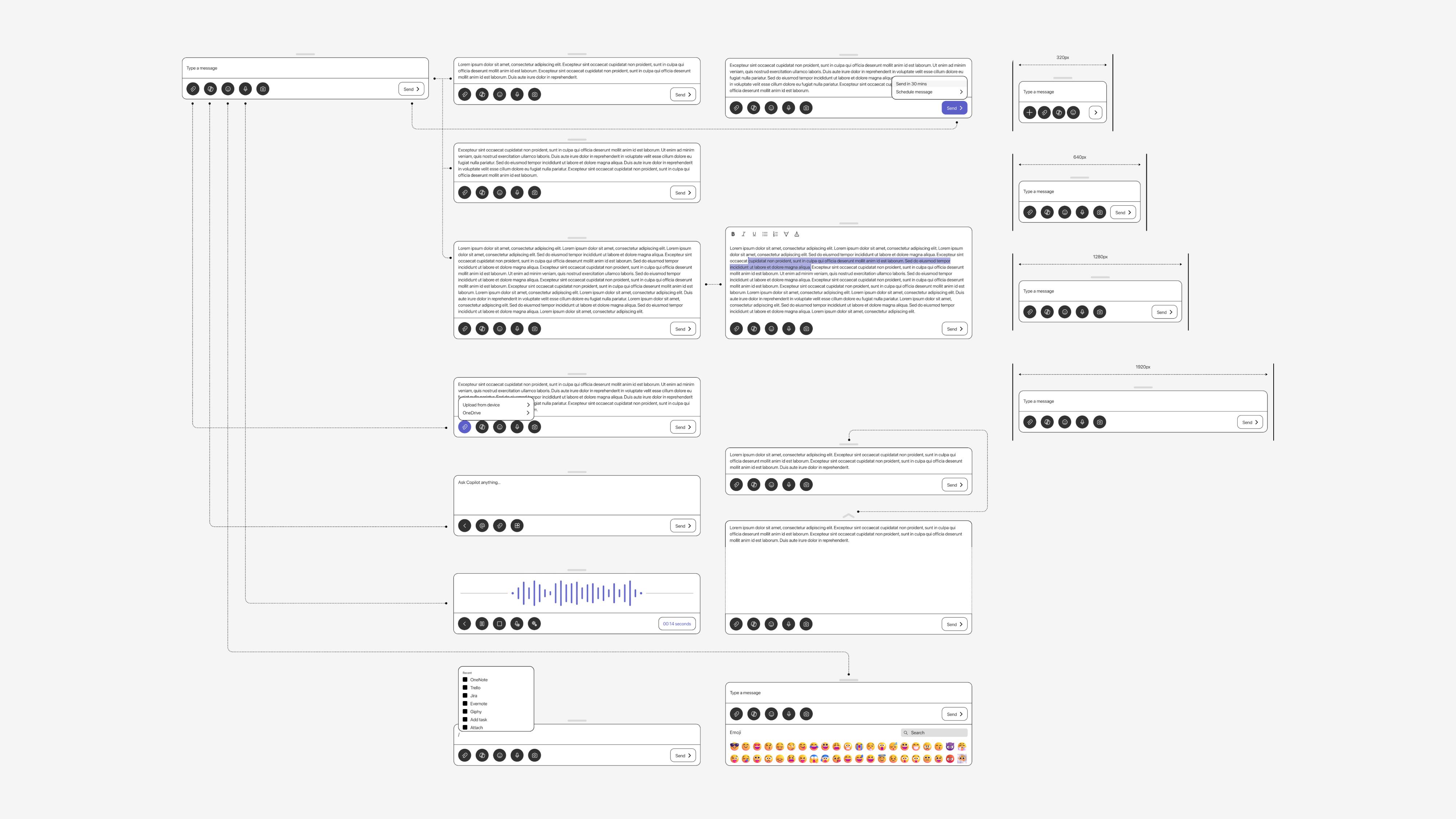
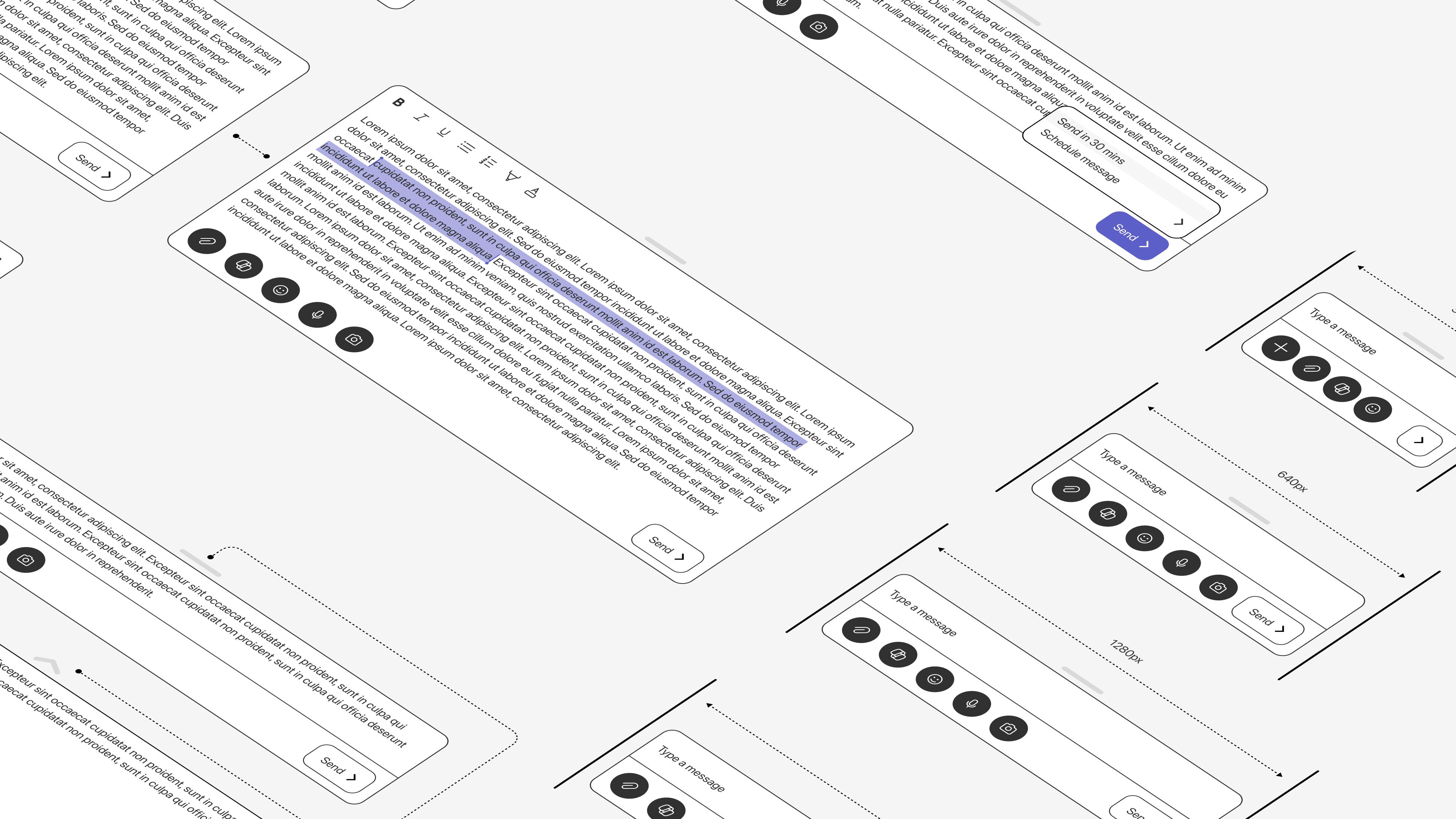
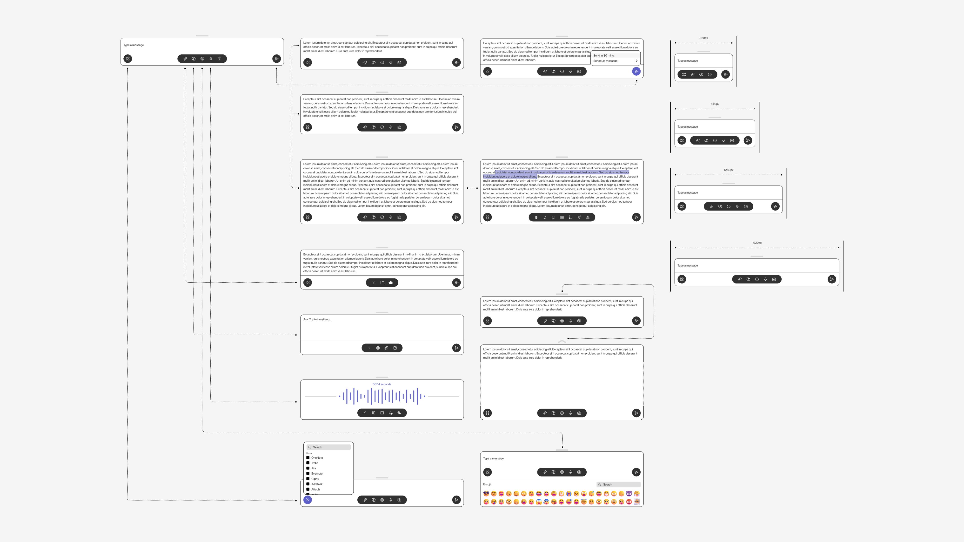
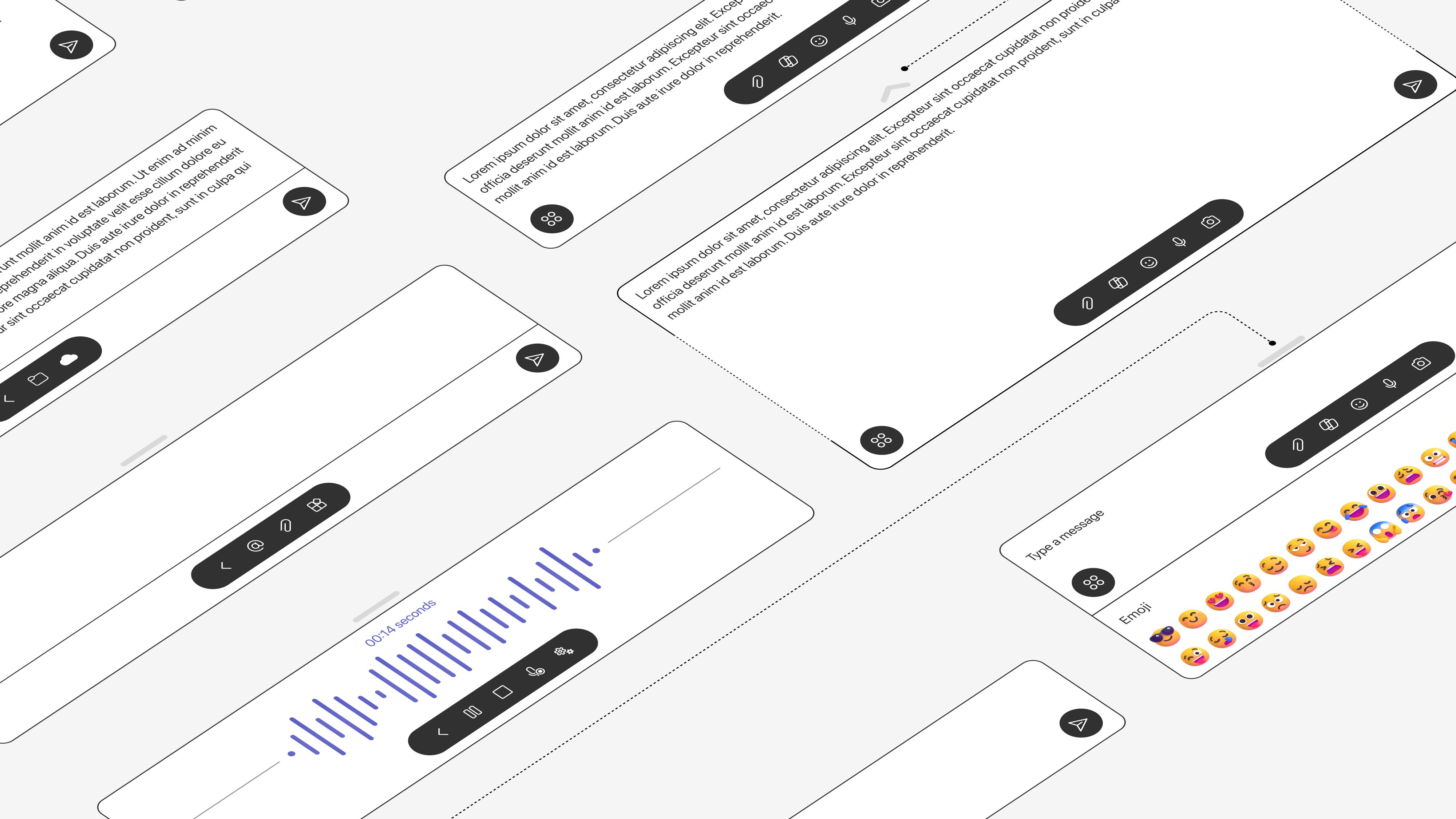
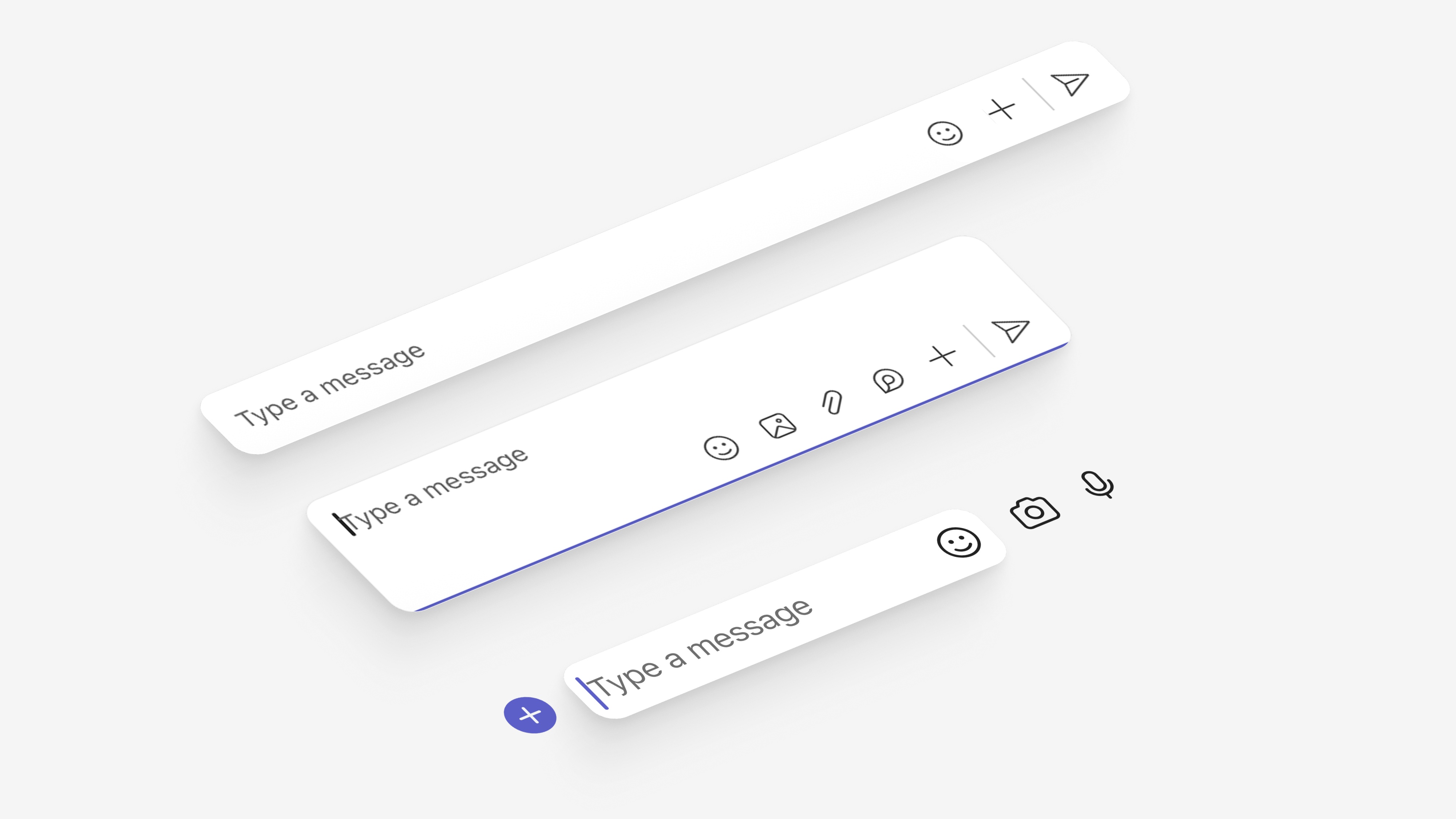
Now the real fun starts. I add a light visual pass to get the concepts ready for testing, pushing the system just enough to explore better spacing, cleaner padding, and stronger color choices while still staying true to the core language. It is the moment where the experience starts to feel real.
I partnered with research early to shape a testing plan that would give us real clarity on both directions. We aligned on what we needed to learn, how we would measure success, and the best ways to capture honest feedback from users.
Partnered with research to identify learning goals and what success would look like for each concept.
Built interactive prototypes for both options alongside static screens to test specific flows.
Ran 24 sessions through in-person and video interviews across different user roles and contexts.
Synthesized feedback into clear themes, surfaced patterns, and shaped recommendations for the team.
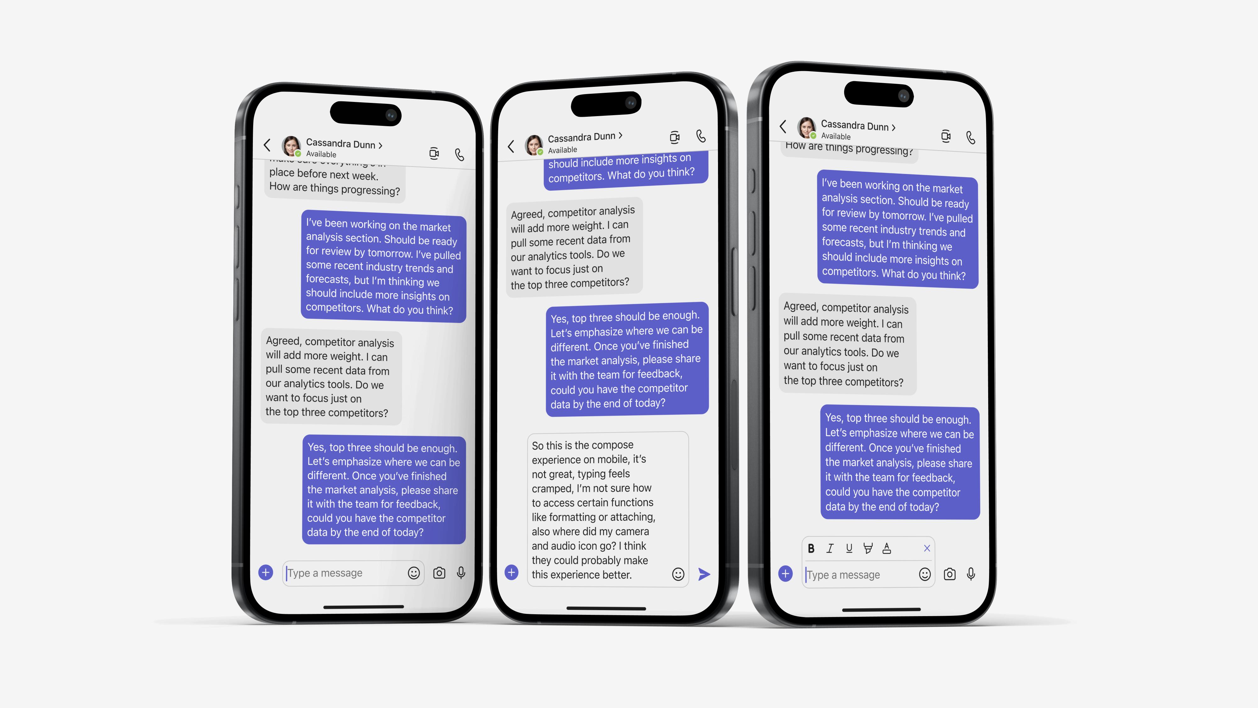
User testing delivered clear results. Both versions were strong, but Version 2.0 won out thanks to the placement and behavior of Adaptive Actions. Users loved how the actions responded to them, sped up collaboration, and stayed out of the way. It felt intuitive, fast, and effortless.
"It's way less overwhelming. I actually know where to look now."
Users responded positively to the layout change, highlighting the clearly defined action areas as a key improvement in efficiency.
"Oh wow, this looks so much better. It doesn't feel like I'm using old software anymore."
Users felt the new Compose looked noticeably more modern and appreciated the bold, refreshed design direction.
"That was easy. I didn't have to dig through menus to find what I needed."
Users called out the new action areas as a win, noting that glanceable icons made actions quicker to find and boosted overall efficiency.
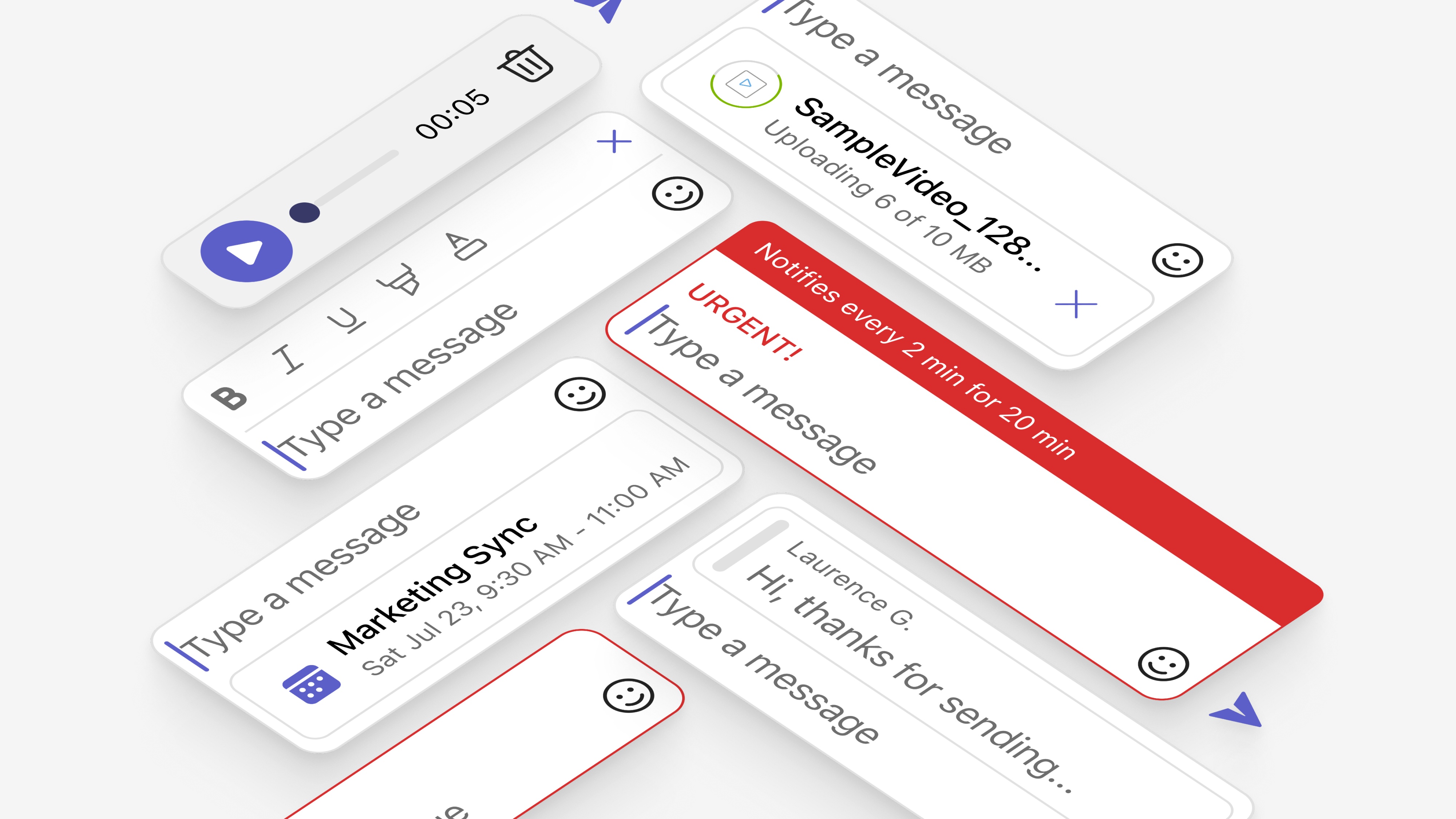
Motion is what brings a design to life for me. I use it to guide people through new features in a way that feels natural and engaging, and to give the interface real presence so it feels more tactile and alive. The small details make a big difference. I also spend time experimenting with motion, animation, and 3D tools, sharing early ideas with the motion team as we shape next steps. What you see here is my own exploration, rough edges and all, which is exactly how it should be at this stage.
The new Compose is a step toward deeper, more seamless collaboration in Microsoft Teams. Since Compose shapes how people communicate and get work done, it needed to be flexible, reliable, and grounded in how users actually work. Adaptive Actions became the breakthrough. They showed we could build an experience that feels effortless for everyone, with no friction and a smooth, intuitive flow that supports real work.
Advocating for utilizing more screen real estate was a real challenge, it took a lot of convincing to change the mindset that users wanted everything all at once.
This project really emphasized the need to design for accessibility from the start, Teams had normally done this after, retrofitting designs with accessibility.
This project was a real opportunity to showcase and advocate for a mobile design system, showing that we could harness one to move faster and with synchronicity.
Overall increase in users drafting and sending messages.
Faster load times across all states and actions of adaptive compose.
Increase in use of adaptive actions such as attach and format.
Increase in overall usage of third party plug ins and apps.
Increase in our Messaging Net Promoter Score for communication/compose.
Compliance with accessibility standards and screen readers.